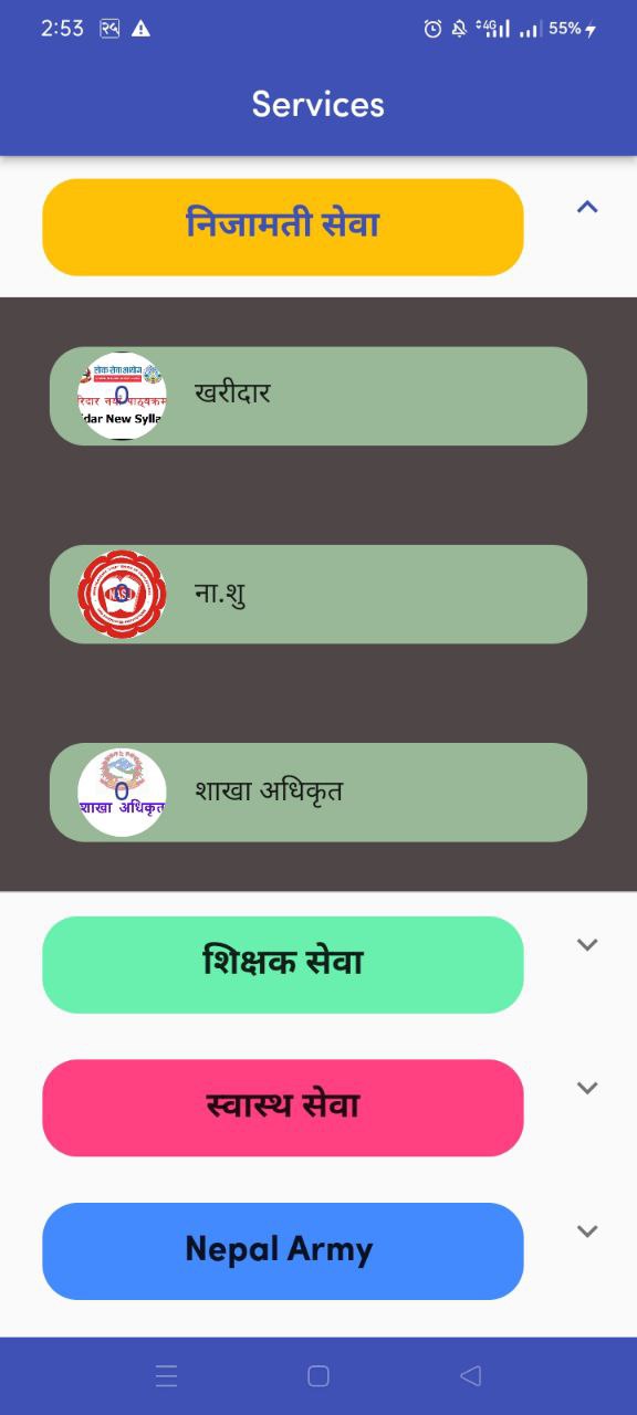
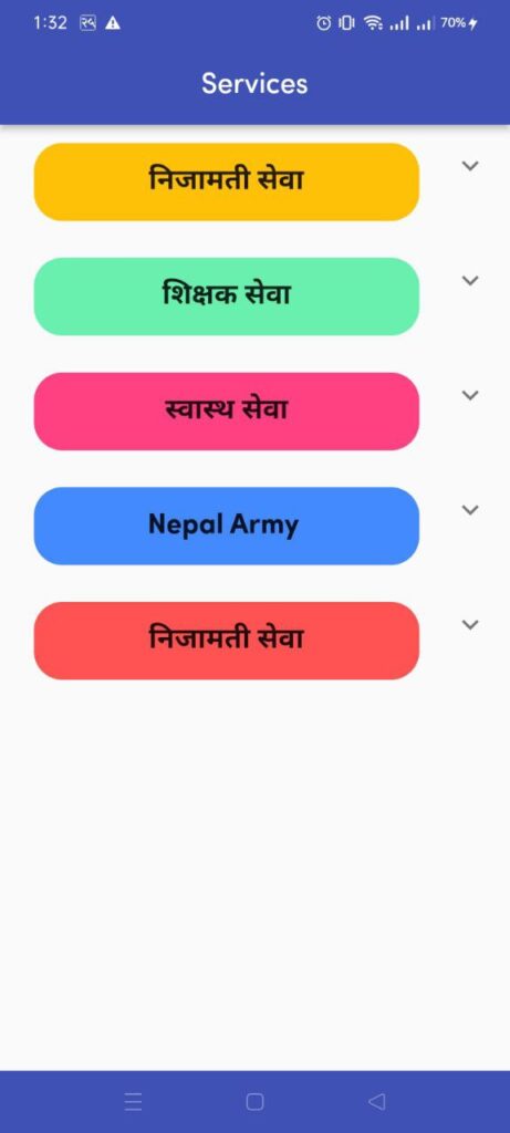
We use Expansion in Flutter to create an expandable widget that allows users to show or hide content by toggling an arrow icon or clicking on the widget itself. The Expansion widget is commonly used to create collapsible and expandable sections of content, like in an FAQ section or an app settings menu.
The Expansion widget has several useful features, such as:
- Animation: The Expansion widget comes with an animation that smoothly expands or collapses the widget, providing a more visually appealing experience for the user.
- Customizable header and content: The Expansion widget allows developers to customize the header and content of the widget with any widget or a list of widgets.
- Built-in icon: The Expansion widget comes with a built-in icon that indicates whether the widget is expanded or collapsed. Developers can customize the icon by changing the
trailingproperty of the Expansion widget. - Toggle functionality: The Expansion widget allows users to toggle the widget between expanded and collapsed states by clicking on the widget itself or the built-in icon.
Overall, the Expansion widget is a powerful tool in Flutter for creating expandable widgets that provide a more interactive and user-friendly experience for the user.

import 'package:flutter/material.dart';

List<Map> services = [
  {
    'title': "निजामती सेवा",
    'color': Colors.amber,
    'items': [
      {'name': "खरीदार", 'imgPath': 'images/khardar.png'},
      {'name': "ना.शु", 'imgPath': 'images/nasu.png'},
      {'name': "शाखा अधिकृत", 'imgPath': 'images/sakha.jpg'},

      // {
      //   'colorr': Colors.black,
      // }
    ]
  },
  {
    'title': "शिक्षक सेवा",
    'color': Colors.greenAccent,
    'items': [
      {'name': "प्रा.वि तह ", 'imgPath': 'images/shikshak-sewa-aayog.jpg'},
      {'name': "नि.मा.वि तह", 'imgPath': 'images/shikshak-sewa-aayog.jpg'},
      {'name': "मा .वि तह ", 'imgPath': 'images/shikshak-sewa-aayog.jpg'}
      // {'colorr': Colors.white},
    ]
  },
  {
    'title': "स्वास्थ सेवा",
    'color': Colors.pinkAccent,
    'items': [
      {'name': "नर्सिंग", 'imgPath': 'images/swesthasewa.png'},
      {'name': "एच.ए", 'imgPath': 'images/swesthasewa.png'},
      {'name': "डेन्टल", 'imgPath': 'images/swesthasewa.png'},

      // {'colorr': Colors.black},
    ]
  },
  {
    'title': "Nepal Army ",
    'color': Colors.blueAccent,
    'items': [
      {'name': "प्रशासन", 'imgPath': 'images/armed_police.png'},
      {'name': "आर्म पोलिस", 'imgPath': 'images/armed_police.png'},
      {'name': "जनता", 'imgPath': 'images/armed_police.png'},

      // {'colorr': Colors.white},
    ]
  },
  {
    'title': "निजामती सेवा",
    'color': Colors.redAccent,
    'items': [
      {'name': "खरिदार", 'imgPath': 'images/khardar.png'},
      {'name': "ना.सु", 'imgPath': 'images/nasu.png'},

      // {'colorr': Colors.black},
    ]
  },
];

class ServiceViewScreen extends StatelessWidget {
  const ServiceViewScreen({super.key});

  @override
  Widget build(BuildContext context) {
    return Scaffold(
        appBar: AppBar(
          title: Text("Services"),
          centerTitle: true,
          // backgroundColor: Color.fromARGB(255, 23, 75, 118),
        ),
        body: ListView.builder(
            itemCount: services.length,
            itemBuilder: (context, index) {
              return Container(
                child: ExpansionTile(
                  title: Padding(
                    padding: const EdgeInsets.all(8.0),
                    child: Container(
                        decoration: BoxDecoration(
                          borderRadius: BorderRadius.circular(20),
                          color: services[index]['color'],
                        ),
                        height: 55,
                        // color: services[index]['color'],
                        child: Center(
                            child: Text(
                          services[index]['title'],
                          style: TextStyle(
                              fontWeight: FontWeight.bold, fontSize: 20),
                        ))),
                  ),
                  children: List.generate(
                      services[index]['items'].length,
                      (indexx) => Container(
                            color: Color.fromARGB(255, 79, 71, 71),
                            child: Padding(
                              padding: const EdgeInsets.all(28.0),
                              child: Container(
                                decoration: BoxDecoration(
                                    borderRadius: BorderRadius.circular(20),
                                    color: Color.fromARGB(255, 152, 184, 152)),
                                // color: services[index]['items'][indexx]['color'],
                                child: ListTile(
                                  leading: CircleAvatar(
                                      radius: 25,
                                      backgroundImage: AssetImage(
                                          services[index]['items'][indexx]
                                              ['imgPath']),
                                      backgroundColor: Colors.white,
                                      child: Center(
                                          child: Text(index.toString()))),
                                  title: Container(
                                      child: Text(services[index]['items']
                                          [indexx]['name'])),
                                ),
                              ),
                            ),
                          )),
                ),
              );
            }));
  }
}